This week we reflected on the dataset from week 4. Since our topic “Employability” is too large and difficult to collect data, we have to give up this direction for now. Another team member came up with a topic and used web scraping to collect various user comments from the website. However, he only did a preliminary collection of data and did not extract and classify the relevant keywords. So at this stage, all we have is a pile of data. That’s why we need to visualize the dataset. This method can help understand and compare important information and present the information to others in an easy-to-understand or simple way.
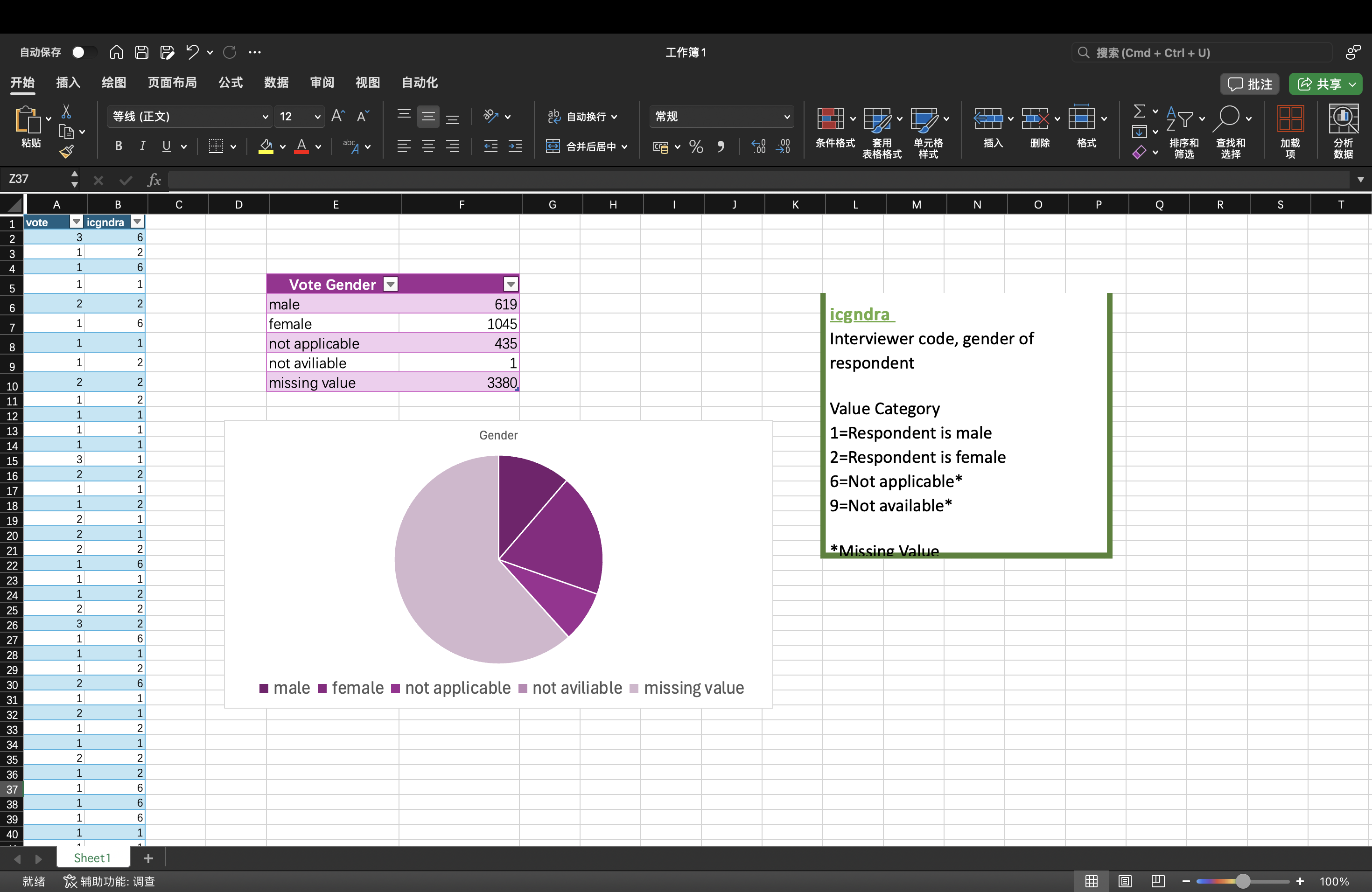
At the same time, we learned some data visualization tools, such as Microsoft Excel and Tableau Public. Then, I created a descriptive pie chart in Excel using the UK data provided by Holly. First, I extracted the required data, and then used the two methods of lookup and sum formulas to make the gender classification and number of voters into Table 1. Male is 1, female is 2, not applicable is 6, not available is 9, missing value is *. Then, I chose to create a pie chart in the table, and finally completed a preliminary data visualization. The reason I chose a pie chart is because there are not many categories of data in this data set, and using this table can more intuitively see the gender ratio of each voter. A bar chart can also have the same effect, but I feel it is not as intuitive as a pie chart.